
Device-Based Heatmaps
Mobile and desktop are not the same story
Mobile visitors do not behave like desktop visitors, and tablet users often tell a third story. Device-Based Heatmaps help you read those differences instead of treating every screen as the same experience.

What it helps you understand
Device-Based Heatmaps helps you review behavior separately for mobile, tablet, and desktop visitors. That matters because most website decisions are still made from opinions, memories, or one big traffic number. A page can look beautiful and still fail to guide visitors. A page can also look modest and quietly do its job very well.
In everyday work, this feature gives you a more honest view of visitor behavior on responsive pages where the order, spacing, and visibility of sections changes between screen sizes. Open it with one clear question in mind: does the page work equally well for the device our visitors actually use? That question keeps the report practical and prevents the team from staring at data without knowing what decision should come next.
How it fits into real site work
Think about a normal review meeting. Someone says the page feels strong. Someone else says the button should move. Another person wants to rewrite the headline. Without behavior data, every opinion can sound equally convincing. Device-Based Heatmaps gives the conversation a better starting point because it shows how visitors respond after the page is live.
You can use it after a redesign, before a campaign review, during a client audit, or when a page gets traffic but does not seem to create enough action. The point is not to collect data for its own sake. The point is to learn what visitors notice, where they hesitate, what they ignore, and which parts of the page deserve the next improvement.
Signals worth watching
The most useful insights usually come from patterns, not from one isolated number. Look for behavior that repeats across enough visits to feel meaningful. Then compare it with what the page was supposed to do.
- A button that performs well on desktop but disappears on mobile
- Mobile taps concentrated around navigation instead of the main action
- Tablet behavior that does not match either phone or desktop assumptions
When one of these signals appears, do not rush to redesign the entire page. A smaller change is often better: improve one label, move one action, simplify one section, or make one next step more obvious. Then review the behavior again over a fresh date range.
A simple workflow
Start with one important page instead of trying to review the whole site at once. Choose a page that has business value: a homepage, a service page, a product page, a pricing page, a contact path, or a landing page. Set a date range that matches the question. For example, use a campaign window for campaign traffic, or use the last 30 days for a normal performance review.
Next, read the report beside the actual page. Ask what the visitor probably saw first, what they were invited to do, and whether the behavior supports that journey. Finally, make one focused change. prioritize fixes for the device that matters most and avoid making decisions from a single screen size. This keeps optimization calm and measurable instead of turning every review into a full redesign.
Who will care about it
This matters to everyone involved in a modern WordPress site. Owners see which device experience needs attention. Designers can judge responsive layouts. Marketers can understand why the same offer may perform differently on mobile and desktop. The same report can support different conversations: a business conversation about results, a design conversation about clarity, a content conversation about attention, or an agency conversation about what should happen next.
It is also useful because it lives inside the WordPress workflow. The people who manage the site can review behavior close to the pages they already publish, edit, and improve. That makes the insight easier to use, not just easier to collect.
Use Device-Based Heatmaps when you want a clearer, more grounded answer before changing a page. The feature is strongest when it turns real visitor behavior into one practical decision. For the full plugin package, visit the WPMC Behavior & Heatmap download page.
 Likes 0
 Comments 0
Preview the WPMC Behavior & Heatmap Dashboard
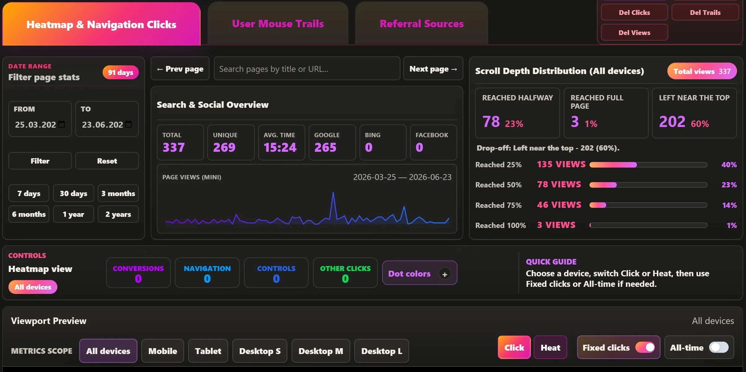
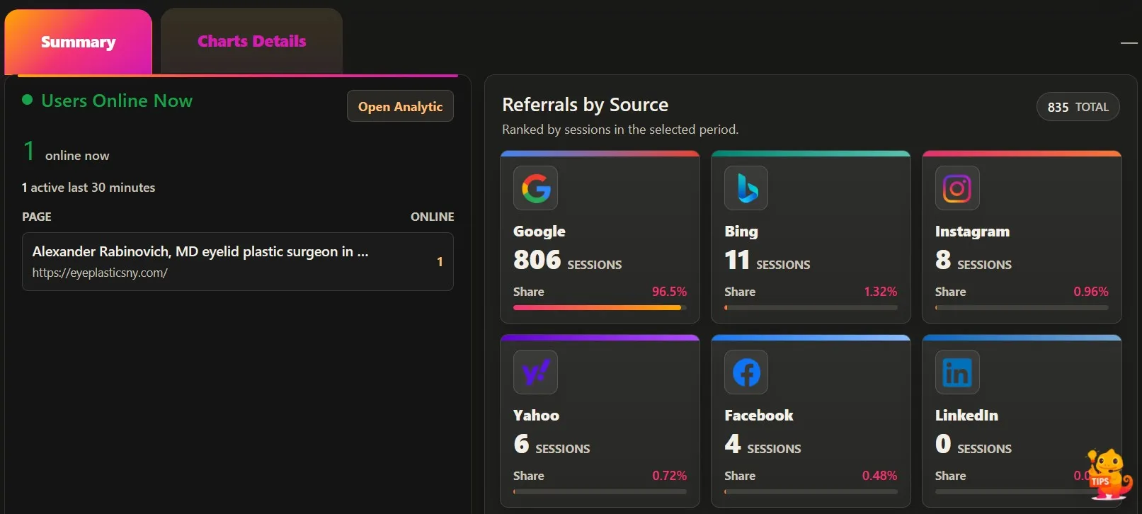
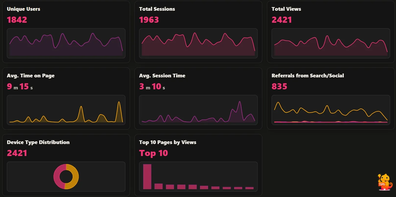
Most analytics tools tell you that something happened. WPMC Behavior & Heatmap is designed to help you understand where it happened, how visitors moved through the page, and which parts of the website actually received attention. Instead of treating behavior data as a separate report, the plugin…
Post Type Filtering
Focus on the content type that matters Different content types often behave differently. Post Type Filtering helps you review pages, posts, products, or custom content groups without mixing every part of the site together. What it helps you…
Visitor Sessions Tracking
Understand visits, not just views A visitor session is a small journey, not just a single page load. Visitor Sessions Tracking helps you understand how people move, pause, continue, or leave during one complete visit. What it helps you unde…
Leave a Comment
Comments